A landscape of neutrals: establishing the base that never dates
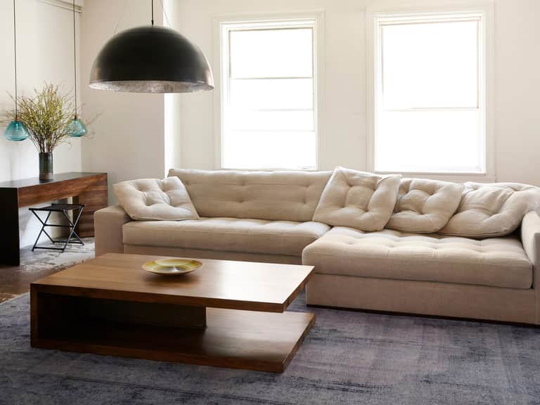
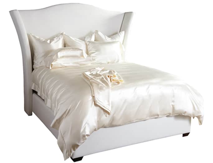
In the most refined living rooms, a calm neutral foundation acts as the stage upon which every other element performs. Neutrals—ranging from warm taupe to cool greys and ivory—do more than simply fill space. They modulate light, amplify texture, and ground the room’s personality. The purpose of a neutral base is not to erase character but to provide a sophisticated canvas that allows form, materiality, and proportion to tell the design story with clarity.
A timeless neutral palette embraces undertones rather than flatly absorbing color. It is the undertones—the subtle warmth of a woolen textile, the cool cast of a marble surface, or the muted warmth of a greige—that will determine harmony among fabrics, woods, metals, and artwork. When readers test neutrals, they should consider how a hue shifts with different light conditions, from the gentle glow of morning sun to the cooler intensity of evening illumination.
Accent colors: the purposeful punctuations that shape mood
If neutrals are the room’s quiet archive, accent colors provide punctuation marks that guide emotion and perception. An accent can be a single architectural detail—an upholstery hue, a rug tone, or a curated collection of cushions—that draws the eye and anchors time-tested design principles such as balance, scale, and proportion. The goal is to introduce color with intention, ensuring that accent tones feel integrated rather than isolated. When selecting accent colors, consider three roles: defining focal points, harmonizing with texture, and reinforcing a desired atmosphere—calm, invigorating, or luxurious.
In sophisticated living rooms, accent colors often lean toward muted sophistication—charcoal, slate, amber, forest, or a refined blush—so as to avoid shouting moments that date quickly. The key is to test scale: a dramatic chair, a single calibrated rug, or a handful of textiles that echo a chosen hue throughout the space. This creates a cohesive color language without overwhelming the senses.
Warm vs. cool undertones: reading the temperature of color
A practical skill for sophisticated living rooms is diagnosing whether colors skew warm or cool and how those tendencies interact with light. Warm undertones—think honey, bronze, or taupe—tend to feel cozy, inviting, and intimate, whereas cool undertones—ice, stone, and graphite—convey precision, modernity, and serenity. The balance between warm and cool influences enhances spatial perception: too much warmth can compress perceived space in small rooms; too much coolness can feel austere without enough texture to soften the edge.
Designers approach undertones as a continuous spectrum. They test textiles side-by-side with wall finishes and furniture tones under the room’s lighting design plan, including natural daylight and artificial illumination. The aim is to ensure that a chosen palette remains legible and harmonious at different times of day, avoiding unintended shifts that can unsettle the design’s intent.
Practical color strategies: quick tests, longer plans, enduring palettes
The color theory toolkit for refined living rooms blends quick, reliable checks with deeper, patient planning. The article presents three briefing ideas to translate theory into practice:
- Timeless palette construction: Build a base from gray, taupe, and ivory foundations, then layer with three carefully chosen accents that repeat across textiles, artwork frames, and accessories. This repetition creates a sense of cohesion without monotony.
- Undertone evaluation in textiles: When evaluating fabrics for sofas, curtains, and cushions, compare swatches under the same lighting to reveal subtle undertone clashes. Select textiles that visually harmonize rather than merely match color names.
- Pre-commitment visual tests: Before committing to a room plan, perform quick visual tests—paint swatches on a wall, place sample fabrics in the space, or photograph mockups at different times of day. Use those observations to adjust the palette for balance and resonance.
The above strategies are not prescriptive manuals but guides to cultivate a disciplined mind for color that respects both the room’s physicality and its evolving use. A sophisticated living room should feel coherent, legible, and inviting—colors acting as an intelligent conductor rather than a loud instrument.
Color, texture, and material interplay: a triad of depth
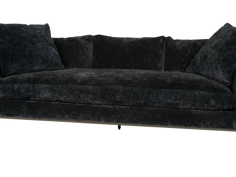
Color rarely exists in isolation. In sophisticated spaces, color interacts with texture and material to create depth. A velvet upholstery, a linen drapery, or a wool rug influences the perceived tone of adjacent walls, floor, and ceiling. The design conversation thus extends beyond color catalogs to embrace the tactile language of textiles, wood grains, metal finishes, and glass reflections. This triad—color, texture, material—produces a multidimensional experience that engages both eyes and touch, enriching the living room’s atmosphere.
Color as narrative: crafting a space that feels intentional
Color theory is not solely about aesthetics; it is about narrative. A refined living room tells a story through careful choices: neutral stages for timeless elegance, accent motifs that reveal taste and curiosity, and undertone awareness that honors the room’s light and proportion. When color is treated as a narrative device, the space evolves with its inhabitants—seasonally refreshed yet grounded in a durable, enduring palette.
Historical perspectives: three voices across time
To illuminate color theory’s lasting impact, this article highlights insights from notable designers and thinkers across distinct eras, whose ideas continue to resonate in contemporary sophisticated living rooms.
1) Le Corbusier (1887–1965): The primacy of light and proportion
Le Corbusier emphasized the harmony of form, light, and space. His principles of light modulation and proportion offer a lineage for neutrals and a disciplined approach to color as a structural element. In refined living rooms, his influence manifests as deliberate, well-proportioned palettes that respect ambient illumination and architectural lines.
2) Marion Dorn (1900–1964): Texture and its color dialogue
Dorn championed tactile richness and bold yet refined color combinations. Her approach underscores how texture and hue collaborate to elevate a space. In contemporary settings, Dorn’s sensibility informs the pairing of plush textiles with muted hues to create depth without visual noise.
3) Nathalie du Pasquier (b. 1957): Bold restraint and color blocks
A contemporary voice, du Pasquier demonstrates how bold blocks of color can coexist with restraint and quiet sophistication. Her ideas invite modern living rooms to embrace striking accents sparingly, ensuring a balance that honors both energy and calm.
A curated color toolkit for readers: applying the theory
The article closes with a practical toolkit designed to empower readers to apply color theory to their own living rooms. It includes a step-by-step guide for auditing existing spaces, a sample color palette based on a refined gray-taupe-ivory base with three accent options, and a brief note on checking undertones across lighting conditions. The goal is not to prescribe a universal look but to offer a disciplined framework that yields enduring, elegant spaces.